 PXRD Material Index
 Previous Page
Plotting traditional d-I stick diagrams in Excel
In addition to comparing a measured PXRD pattern with the PXRD pattern of
a standard material, comparisons can also be made to databases containing
PXRD information. The simplest comparison is one based on peak positions
and relative intensities (or heights). Such PXRD data forms part of the:
 International Centre for Diffraction Data
PDF (=Powder Diffraction File) databases, formerly known as the JCPDS database.
The content and use of these databases is explained elsewhere, but a "traditional"
view of the content of a PDF2 database entry is shown below for the material
illustrated in these pages, namely calcium phosphate hydroxide more commonly
known by its mineral name of hydoxyapatite:
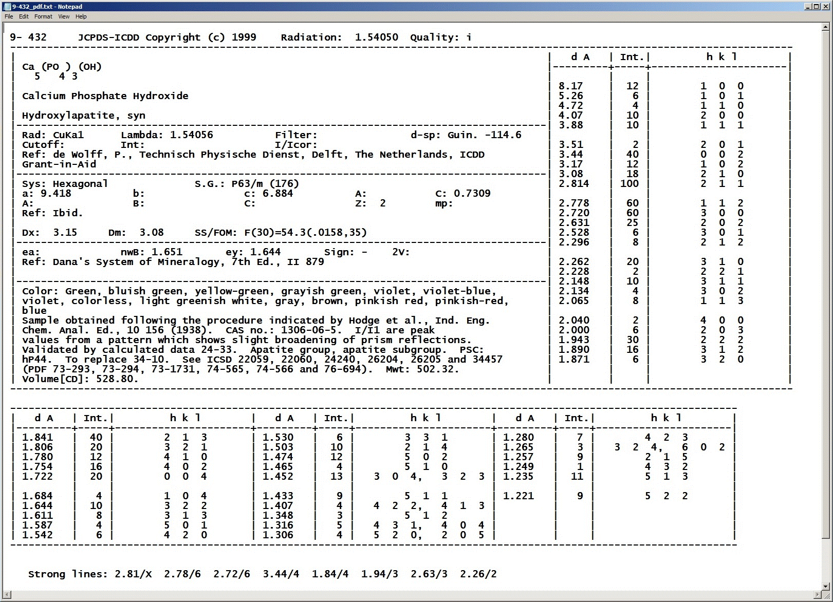
The key point to note is that a crystalline substance is
characterised by d-spacing values and not by 2θ values
since the latter values depend on the choice
of X-rays used to measure the PXRD data, whereas d-spacings are intrinsic
to the material and are X-ray wavelength independant.
It is very useful to be able to plot this type of data on top
of a plot of our measured diffraction data.
"Search-match" software provided by the various X-ray diffractometer manufacturers
often has this facility built in, but occasionally one may want to generate
a similar style plot using Excel. This page shows one how to do this given
text-based d-I data such as that created in file
9-432.txt (example file available on UCL Moodle).
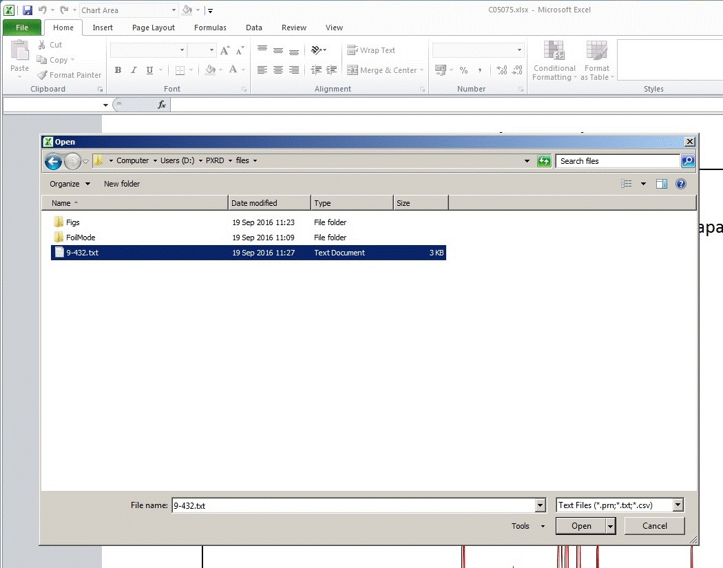
The first step is to import the data into Excel, so choose Open and select
the text file:
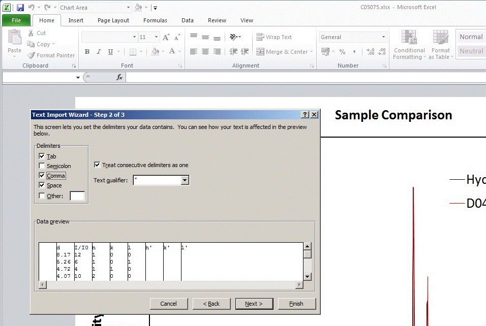
Then choose the option Delimited. Note that the option fixed width can
be used for this file, but with great care since the d-spacing values in the
first column vary in the number of decimal places provided: smaller d-spacings
are quoted with more decimal places than for larger values.

For this text file, I have clicked on both space and comma delimited since a few
peaks have been assigned with multiple hkl values separated by a comma:
The database entry saved in the plain text file will appear as seen
in the spreadsheet below:
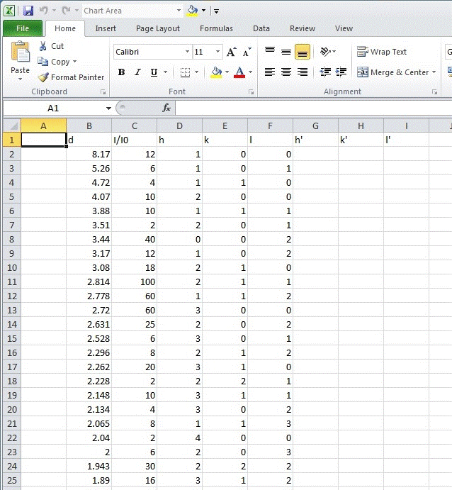
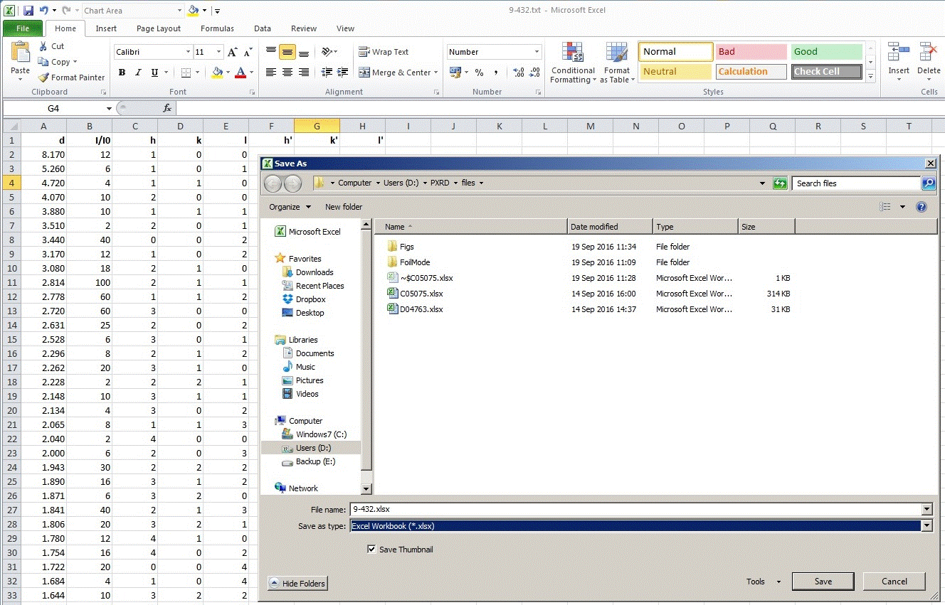
The first empty column should be deleted, the columns of numbers can
be formatted with an appropriate number of decimarl places, the column headings
set to bold type, and the data then saved as an Excel workbook:
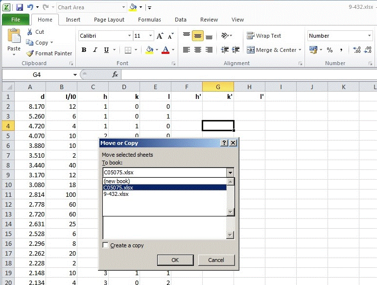
The next step is to move the database data entry to the same workbook
as that containing the plot. So under Format on the Home tab, select Move or Copy
and then select the Excel file containing your PXRD and plot as shown below
(assuming that the file is already open Excel):
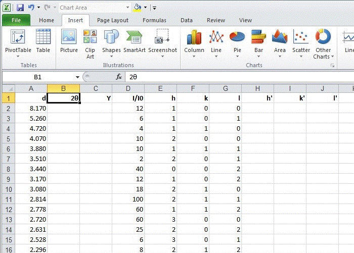
Since we do not want to plot d-spacing values on the plot, we need
to convert the values in Ångstroms to 2θ values in degrees. Firstly,
insert two blank columns after the column of d-spacing values and label
the columns as 2θ and, say, Y as shown:
Using Bragg's law: λ = 2d sinθ,
we can now calculate 2θ values from the d-spacing values as shown:
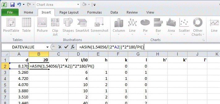
In the screenshot above, I have used the value 1.54056 Å for the
wavelength. Note that it would have been better practice to use the cell identifier
(='C05075'!E8 in this set of web pages as seen
earlier)
which stores the actual value of the wavelength used for the measurement
rather than hardwire a new value (and marginally different value!) as seen above.
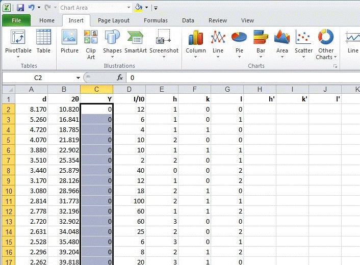
Then set the values in column Y to zero: the reason for the choice of zero
is that we will be drawing the vertical stick markers upwards from the baseline
which is set to zero.
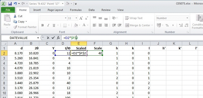
The next step is to create scaled intensity values since the ones from the database
are scaled to I/I0, I0 is the most intense
diffraction peak (with values given as percentage). Hence, insert two more columns
after I/I0 and labelled them Scaled and Scale. In the second
of these empty columns I have inserted the value 40 since the most intense peak
in the PXRD pattern has a count of about 4000. The values in the "Scaled" column can
then be set equal to the I/I0 values multiplied by the scale
factor as shown below:
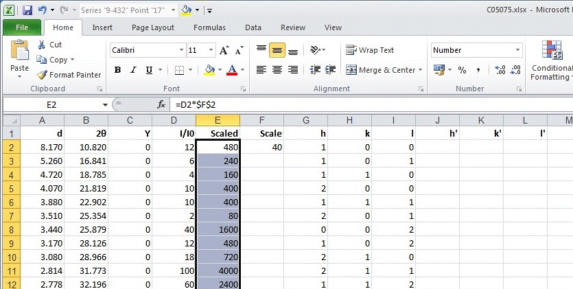
The worksheet should now appear like this with values of 2θ and scaled
intensity:
Now return to the chart, right-button mouse click, and choose select data
to add further data to the plot. Choose add series and select the data
from the 9-432 worksheet that you have just created. For the X values,
select the 2θ values and for the Y values, simply select the column
labelled Y (containing the zeros). The series name can be set to be the
database entry number 9-432 as shown:

Click on OK to return to the Select Data Source menu and this data series should
now be listed though no sticks will be visible just yet!
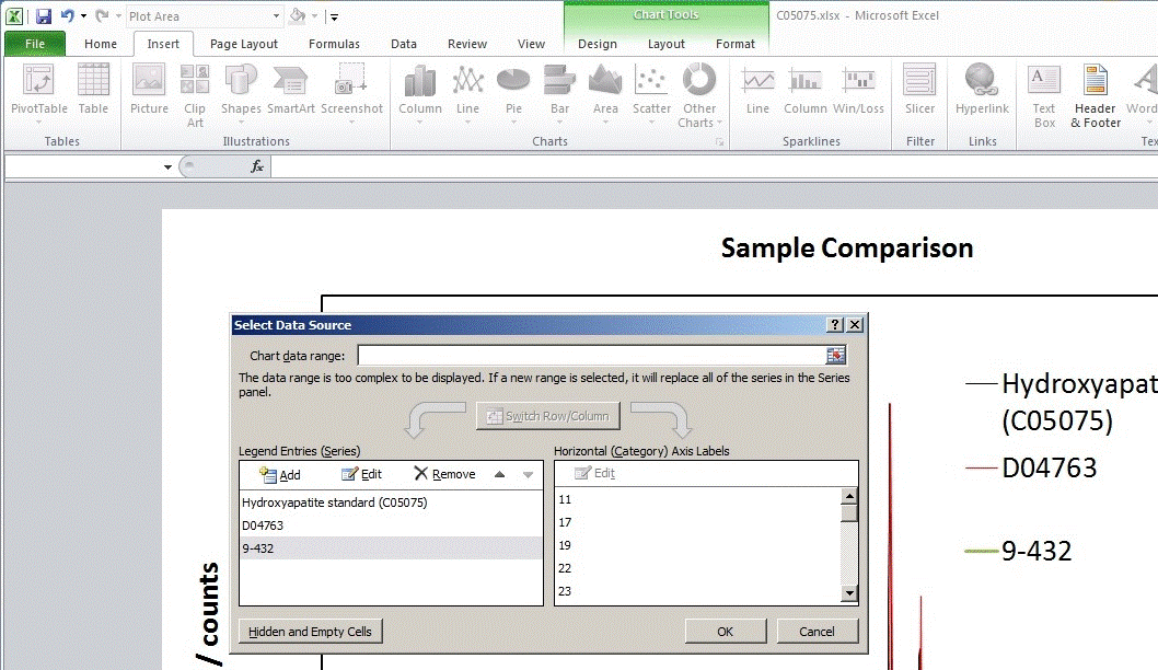
Then click on OK to accept the series.
Since the database entry is now a line at the bottom of the plot, it is difficult
to select it with the mouse. Return to the worksheet containing the column of zeros
and simply set one of the values to a largish non-zero value as shown:
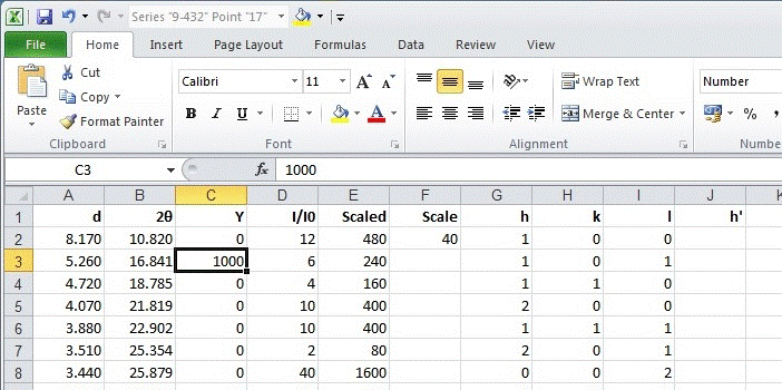
Return to the chart and the data series should now be easy to select using the
arbitrary intensity point just created (see below). Then under Chart Tools,
select Layout and under the Error Bars dropdown menu, select
More Error Bars Options... as shown:

A new menu labelled Format Error Bars should now be visible. Check that
it refers to Vertical Error Bars as by default Excel will add-in error bars for
both X and Y. Under direction, select Plus and
under end style, select No Cap. Finally, under amount select Custom
so as to be able to Specify Value:

Choose specify value for the size of the "error" bar
(which are going to be the "stick marks" in our plot) and
selected the scaled values for intensity that we generated earlier:
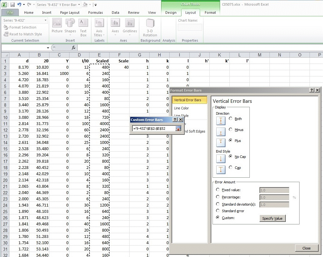
After selecting the scaled intensity values for the "error" bar,
return to the Format Error Bars menu and choose Line Color and Line Style
in turn. In this example, I have chosen blue for the color and 2 pt for
the thickness of the vertical sticks:
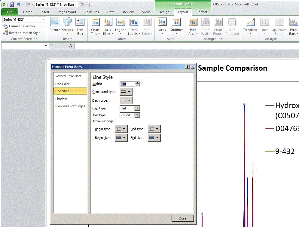
Blue vertical sticks representing database relative peak intensities are now visible.
When preparing the screenshots, Excel added in default X-error bars.
These can be selected and deleted with the mouse (right-button click to get the
menu to appear):
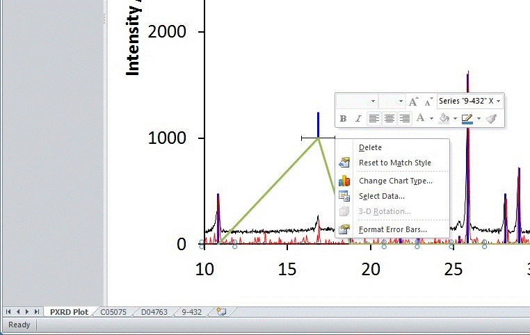
Then select the data series and choose the option Format
Data Series... from the menu:
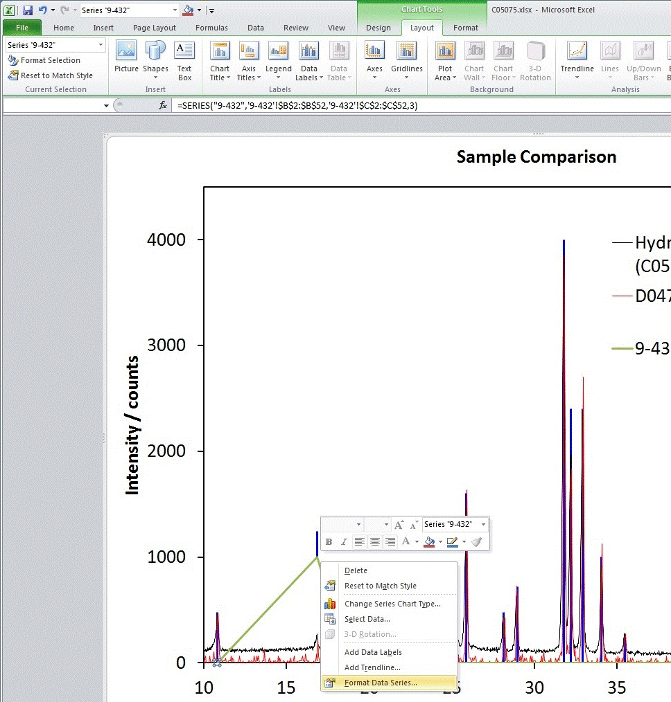
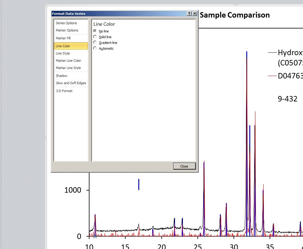
There are several approaches at this point. One is to simply set No line
for the data so that only the sticks are visible. This has the disadvantage that
no line is visible in the legend for the data series also. An alternative approach
is to choose solid line and set the colour to be the same as for the vertical sticks
and the line thickness to be the same as that used for the raw diffraction patterns:
Finally, return to the worksheet containing the database entry and reset the Y value
previously set to, say, 1000 back to 0.
Note that if a solid line has been used to join the database points, this can
now be made invisible on the plot by setting all of the Y values to, say, -1
since the minimum of the Y-axis scale is 0. The appearance of
the final plot showing both data sets and the ICDD database entry
should be as below:
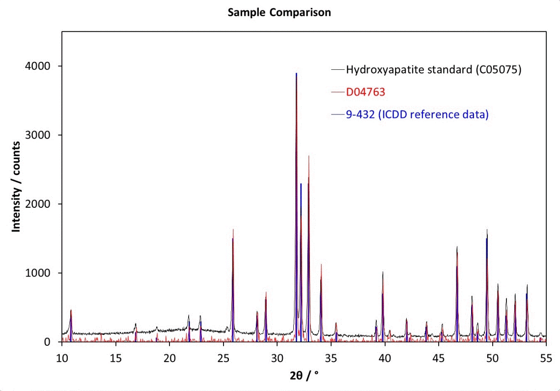
In order to emphasis the meaning of the different colours used in this plot, the
legend text has been colour coded to match that of the PXRD patterns and the
stick diagram.
 PXRD Material Index
 Previous Page
|
© Copyright 2016.
|
Author(s):
Jeremy Karl Cockcroft |


![]() International Centre for Diffraction Data
PDF (=Powder Diffraction File) databases, formerly known as the JCPDS database.
International Centre for Diffraction Data
PDF (=Powder Diffraction File) databases, formerly known as the JCPDS database.