 PXRD Material Index
 Previous Page
 Next Page
Generation of an X-Y plot using Excel
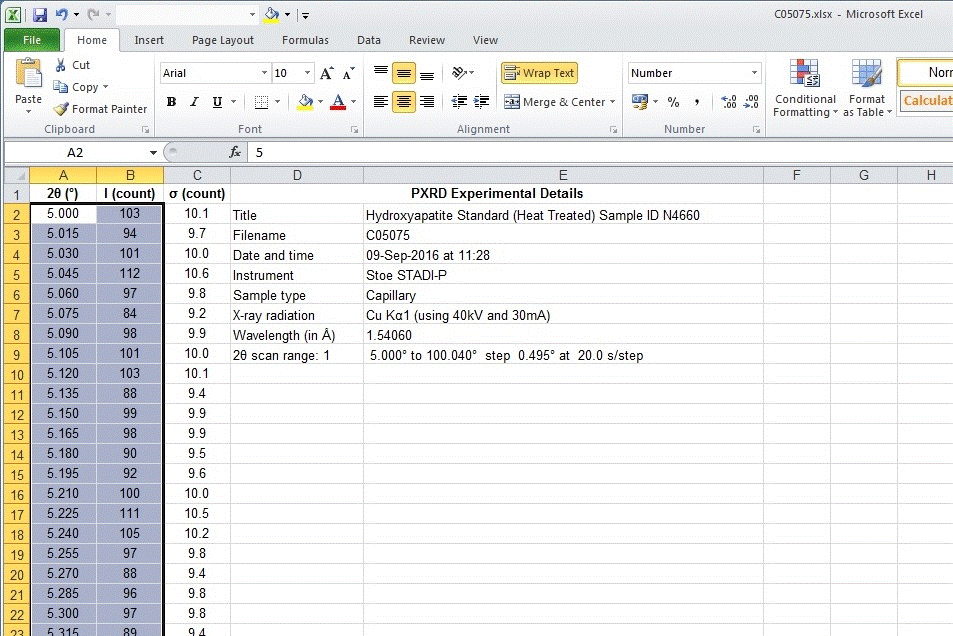
Select the 2θ and intensity data using the mouse as shown below:
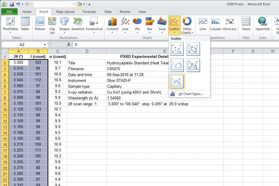
Insert an XY scatter plot. Choose the option that simply joins the data
points with a solid line. Do not choose the option that shows the
individual data points for this type of data. (It can be useful to show
individual points when plotting a small range of data, but not for the
whole PXRD data set.)
Do not choose an option that smooths the data:
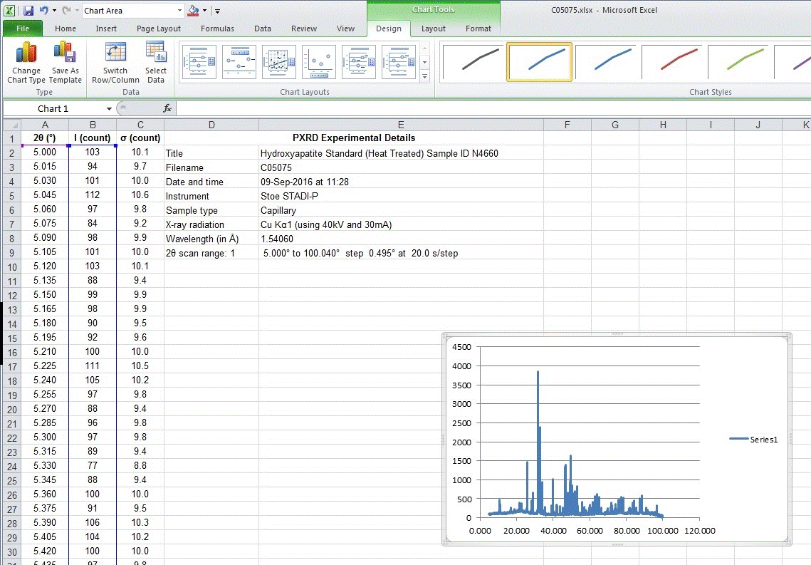
A plot will appear on top of the current worksheet as shown below.
In the version of Excel used for these web pages (Microsoft Office 2010),
the plot is superimposed on top of the worksheet and not
as a separate tab by default, which is a bad default for producing a
publication quality plot.
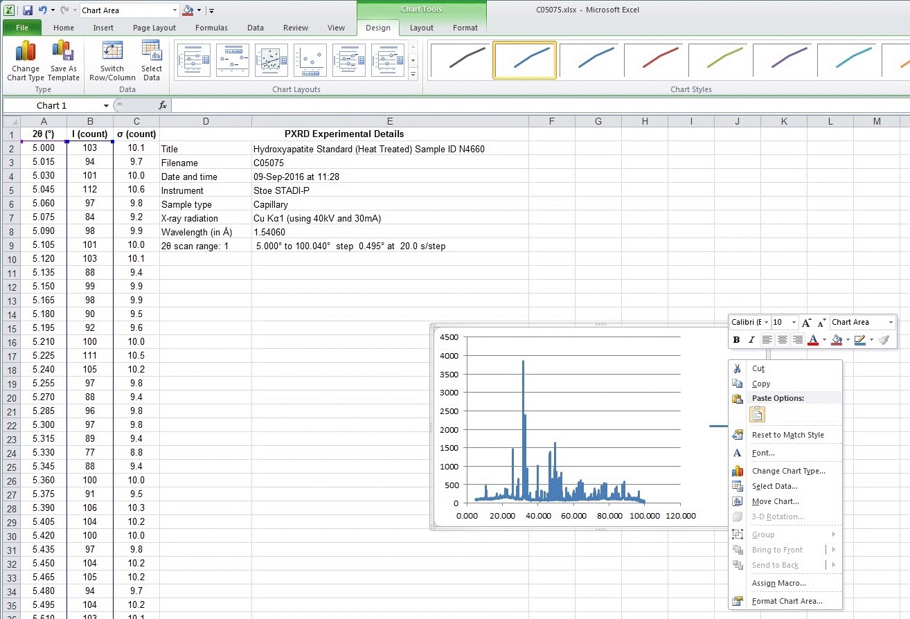
A right click of the mouse on a blank part of the plot reveals a menu
with the option to move the chart to a separate tab as shown below:
The Move Chart option allows the tab for the plot to be renamed
from the default text of Chart 1 when it is moved as shown:
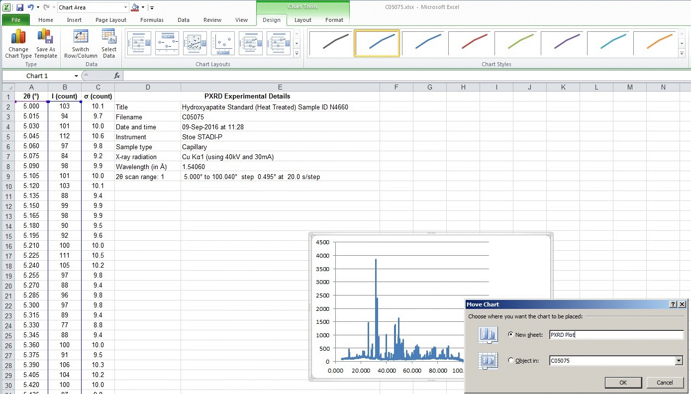
If you forget to do this, simply right mouse click on the default tab name
of Chart 1 and use the rename option.
A large plot is now visible but the default drawing options for X-Y
graphs are very poor. In older versions of Excel (pre-2007), the
default chart options were even worse than those seen below and
included a grey background to the plot:

The default/automatic options for the plot chosen by Excel are particularly
poor and so the plot as produced initially is not suitable for
publication. The next steps show how to improve the plot.
 PXRD Material Index
 Previous Page
 Next Page
|
© Copyright 2015-2016.
|
Author(s):
Jeremy Karl Cockcroft |

